The LLLL framework
The purpose of this website is to display three articles belonging to the same theme/main topic. The two main scopes of the site are the following: 1) displaying articles of a certain issue with different styles and layouts each heavily influenced by real typographic movements, and 2) performing cross analysis of textual metadata. The general idea behind the site is to filter the articles according to our needs and desires, in the same way we usually exploit optical glasses.
The articles and the typographical styles
In order to achieve these two results, Ajax has been implemented. We created a main Ajax structure using jQuery that automatically and dynamically creates paths for the available issues, placing them in the homepage in which the user can start the navigation. Inside each issue the user can decide to read and to scroll independently each article. Depending on the number of articles displayed at the same time(with a maximum of three per issue), the main container changes size accordingly (always allowing for independent scrolling). This has been achieved by using Twitter Bootstrap classes to create a rows-columns layout; for instance, the articles are contained in different columns, namely col-4 if there are three, col-6 if there are two and a single col-12 if there is only one.
A proper script has been created for dynamically switch between six (with an additional bonus) typographical stiles (see next section) without ever reloading the page. All the .css files are loaded in the page but by default they are deactivated. When the user click on an icon representing a typographical style, the script automatically deactivate the main .css and activate the related typographical .css.
The metadata
Metadata are also display automatically with jQuery. In the same .json file there are various metadata that we believe are interesting for the readers, and the script is able to retrieve them and put them in their relative position. Then it is also possible to retrieve and display metadata information regarding the actual text of the articles. By clicking on different checkbox on the left sidebar, users can retrieve information from the text, for instance asking the system who has been mentioned in the article. For doing so, a mix of JavaScript and HTML markup has been implemented. The whole application has been created in such a way that it is possible to add issues and/or articles in a fast and dynamic way, simply by chaging the json files and putting the related html files.
Experimental analysis
Additional, some specific form of textual analysis for the articles was developed. This account to a single Python script that is able to automatically strip a webpage of all its markup and to perform some very basic sentimental analysis on it. In order to do so, the nltk library was mostly used to tokenize the text and to retrieve the most common words in the text. Finally, the script is able to give to each article a sentimental score divide in three categories: a positive one, a neutral one and a negative one. If you are brave enough, you can browse the Python code on this Colab file.
For sake of simplicity, and since we do not have priori knowledge of server-based application, the script was run locally and the results stored in .json files which are loaded similarly to the articles metadata.
The Articles Markup
The articles are marked up according to the specific requirements of our project work. In a firs phase, we added the basic markup structure (division into paragraphs, sections such as titles, subtitles and more). To this division we added those elements that would serve as the bone structure for the design of the typographic styles. We applied a division, for instance, between the “article head”, composed of the title and subtitle, author, date and eventually a cover image, and the “article body”, where the rest of the article text and subsections can be found. Moreover, we used the attribute class to mark up some elements which would require some particular focus in the design process. For example, the class “drop-cap” was useful in the creation of the 90s style.
In a second phase, we added some “semantic” markup, that is fundamental for the implementation of some features such as the metadata function described above. Thanks to the attribute “about”, we were able to extract metadata from the articles. The metadata markup bit is crucially important. We decided to identify five classes of interest:
- Companies and Institutions: this class includes universities, research centers, brands, firms, companies and was identified in the markup with the class “company”.
- People: this class includes every personal name, the markup used is class “pers”.
- Places, the class value is “pl”.
- Dates, with the class value “date”.
- Keywords: these are the words that are deemed the best at representing the theme of the issue and of the article, they were marked with the class “key”
The attribute about, instead, was used to specify the specific entity. So, for example if we find the name “Elon Musk”, we will assign the class “pers”, while the attribute about will have value “Elon Musk”. These two attributes combined allowed a smooth and precise retrieval of metadata.
Finally, thanks to the assignment of a unique id to the “h” (h2 and h3 elements) elements, we were able to implement the subtitle finder tool, which allows to retrieve the sectioning of each article and redirect the user to one desired section inside the text.
The themes
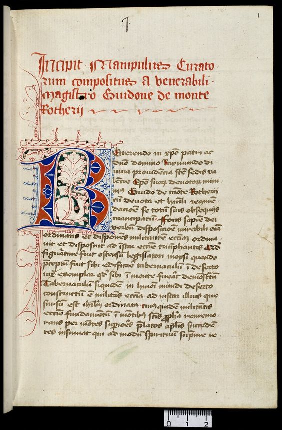
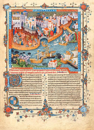
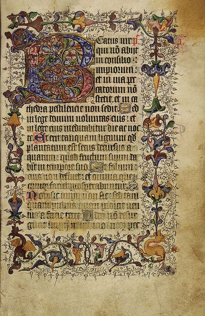
1300 - The Illuminated manuscript era
Background
The Middle Age, often mistakenly thought of as a dark, uncultured age, saw the diffusion of a peculiar way of disseminating culture: the handwritten copying of texts. During this time, inside the lively context of convents and universities, copyists were busy preserving the cultural heritage of ancient civilisations (many texts from Greek and Roman philosophers survived to these days thanks to these people) and passing down important religious texts.
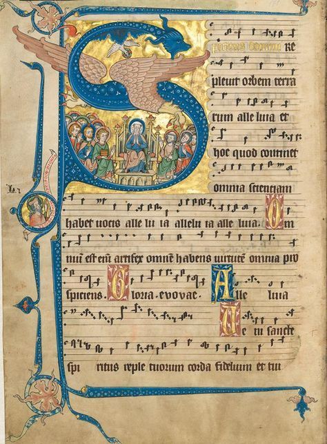
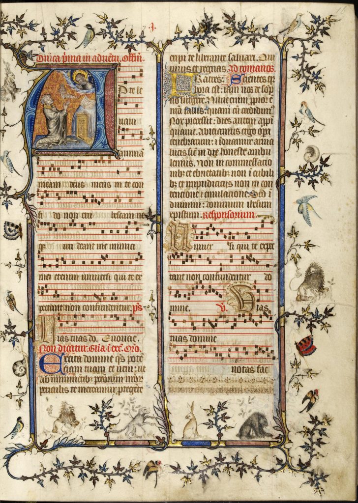
Alongside the mission of preserving and transmitting culture, the period saw the birth of the art of illuminated manuscripts: handwritten books that have been decorated (illuminated) with gold, silver, or brilliant colours. Illuminations may include small illustrations (called miniatures), initials, borders, or other decorative elements. They were used to indicate divisions in a text, to tell stories, and to add beauty and visually memorable elements to texts. Manuscript illumination reached its high point in medieval Europe, when illuminators, working within workshops called scriptoria, produced illuminated psalters, Bibles, liturgical texts, illustrated saints’ lives, and other works.
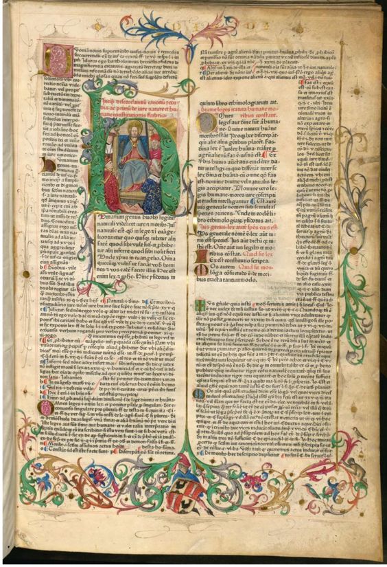
The page layout is not strictly defined by any decisive rule, although some frequent characteristics can be spotted. It is possible to find text divided into 2 justified columns, unjustified text on just one column, and all the variants in between. Occasionally, the text is interrupted by an image, most often the picture occupies the whole width of the page, but again, it is possible to find embedded images that are surrounded by the text. It is nonetheless possible to define some communalities, the first being the decorations to the first letters (first letter of the page, of the paragraph, just of the title). The use of colours is another most decisive communality among the various codices: while the text is almost always of neutral colours (black, brownish), the titles, subtitles, decorated letters and frames are always of bright, deep, vibrant colours. Also, illuminations are sometimes used to divide the text, to visually signal the end and the beginning of a certain block of text. Finally, most of the manuscripts taken into consideration made use of parchment as their material support. A very few illuminated fragments survive on papyrus, which is less durable than parchment. The parchment used for illuminated manuscripts is a high-quality parchment, called vellum.
The layout
Taking into consideration the abyss that separates the two media type, the webpage layout has been thought to resemble an illuminated manuscript as closely as possible.
A parchment-looking background has been chosen to recreate the manuscripts material support. This background needed nonetheless to be adaptable to the features of a webpage: while old parchment often presents stains and wrecked borders, our chosen background should not exceed in those features in order to grant readability and repeatability (the image is often repeated two to three times to fit in the screen, so very noticeable stains would have hindered the seamless perception of the page).
For what concerns the text, the article was divided into two columns, while the text from the front page remained on one column. This is due to the aforementioned variation in text layout and pagination observed in medieval manuscripts. The choice of separating the articles’ texts in two columns is also advantageous for avoiding over-repeating the background image, and thus creating a more eye-pleasing view. Paragraph’s first letters and titles use a distinguishable font variation, in order to visually respect the decorations on letters typical of the period. Also, the use of colours (specifically a deep red and a vivacious blue) have been used for titles and subtitles. These colours have been directly picked from some instances of real manuscripts via a very handy browser extension called Color-Picker, which allows to define the exact RBG values of a specific isolated pixel in an image.
Now, for what concerns the insertion of some more “advanced” illuminations, we opted for an image, directly taken from instances of real illuminations, that has been inserted alongside the articles, but outside their actual box. Both on the front page and on the articles page, we inserted two images on the side (left side for the articles, both sided for the main page) of the text-containing boxes. The illuminations chosen contain two distinct aspects of the medieval illumination art: animals and floral plots, alongside the common feature of being extremely original and very colourful.
The colours
The colours are a fundamental part of a medieval illuminated manuscript. Trying to be as mindful of that as possible, we nonetheless isolated here the three predominant colours used to render the textual part of the webpage, also including the parchment tone we researched for the background image. For the illuminations, please refer to the pictured of manuscripts reported below.
Cardinal Red
#cc072f
Jackson purple
#231f99
Parchment
#ede4c9
Sources
In this section, it is possible to identify the different layout and styles of the period and also to appreciate the wide use of colours, alongside the variety of themes used in the miniatures.
1800 - The Victorian Age
Background
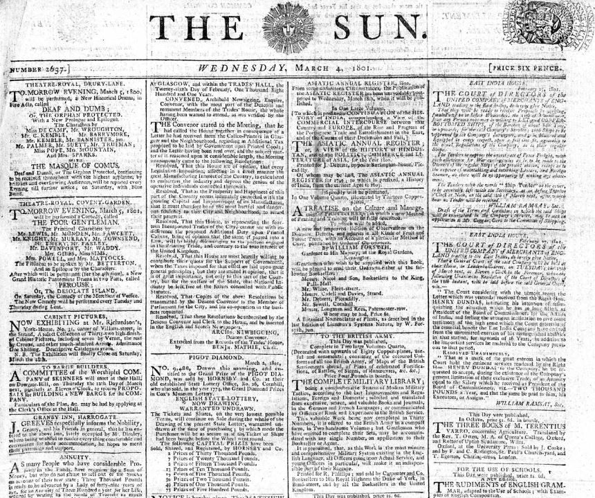
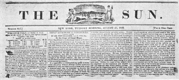
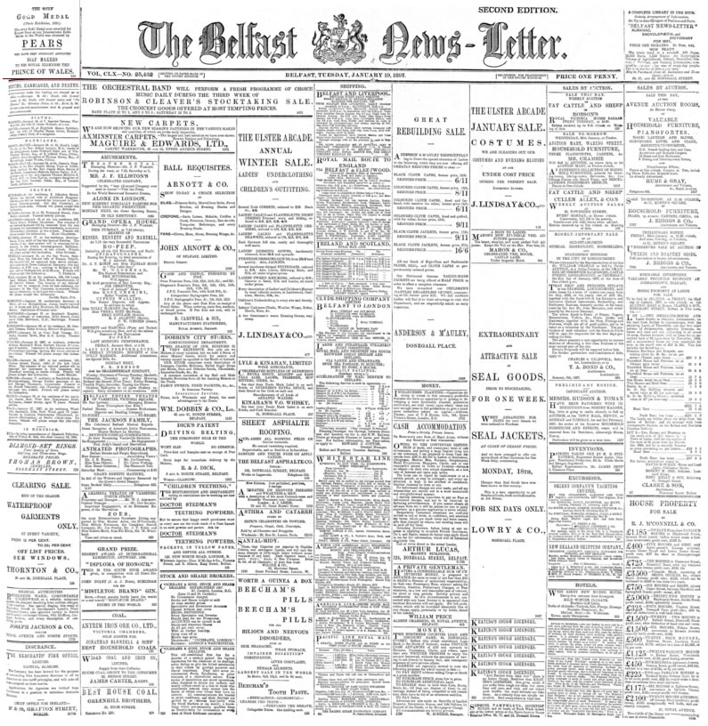
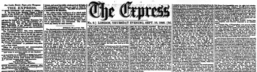
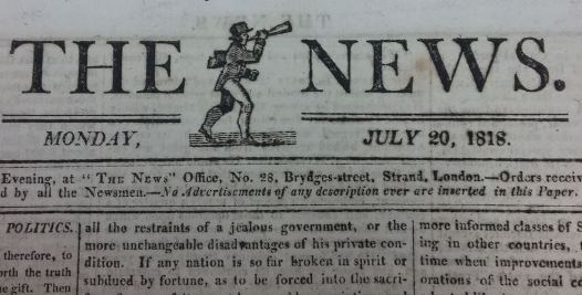
The reign of queen Victoria spanned through almost the entirety of the 19th century; indeed the young monarch ascended the throne 1837 at the age of 19 and died in 1901. Her sovereignty lasted for over 60 years, making it the longer reign up until that time. Even though the title for most enduring reign has been equalled by the current monarch, Elizabeth I, the Victorian era will always be remembered as a period of unprecedented wealth and power for the United Kingdom. In fact, the reign of Queen Victoria was characterized by political stability, and revolutionary developments in transport and communication.
During the Victorian age we witness the industrialization of printing, thanks to the invention of the steam press: this innovation profoundly influenced the production and distribution of newspapers in Great Britain. As a matter of fact, accomplice the significant reduction of the stamp tax (from four pence to one penny) in 1836 alongside the mentioned technological developments of those years, the circulation of newspaper in the nineteenth century was deeply affected, reaching an amount of prints such as to inaugurate the very notion of mass media.
It is important to point out that it was in this period that newspapers began to experience a higher degree of freedom of the press; therefore, periodicals can be considered as both a precious record of historical, economic and political matters but also as a reflection of the Victorian dynamic cultural and society.
Many flagship periodicals that were born in this period are still being published today: e.g., The Daily Telegraph was first published in 1855 and the Daily Mail, born in 1896.
The layout
For the parchment we decided to opt for this grainy off-white paper. In fact, even though in the beginning of the century in question the papers were generally yellowish due to the “hard water” procedure, by the time Queen Victoria came to the throne progresses had already been made in this sense: ground lime which contains calcium carbonate was used to cleanse the fibers during the beating process resulting in off-white papers.
The main title should stand out and catch the reader’s eye. We decided to use cloister, an elaborated serif typeface with ornate borders that is part of the “old-style” typefaces designed by American typeface designer Morris Fuller Benton. Even though the publication date of cloister is subsequent to the XIX century we believe it is a good fit for the Victorian style, as a matter of fact, the resemblance with newspaper fonts of the time is quite striking.
The subtitle is always in uppercase, and the font used is Clarendon: a slab-serif typeface released by a type foundry called Fann Street Foundry in 1845. The slab-serif typefaces appeared in the XIX century and are characterized by thick, blocky serifs and a uniform stroke that helps making the printing process faster. The slab serif fonts are used to catch the reader’s attention or increase legibility in small characters.
The date and the author of the article (also in Clarendon) are located, ideally, right under the main title and they are contained inside a div with a special class that has a top and bottom border of 2px each. Secondary titles (e.g., h3, h4 and so on) are also in Clarendon; they have a solid border of 2px top and 2px bottom; moreover, after every secondary title the first letter of the first paragraph showcases font variations (drop-cap) as it was in use in the XIX century.
The paragraphs are in Bodoni Moda: this specific font is a variation of Bodoni, the serif typefaces first designed by Giambattista Bodoni in the late XVIII century that was still widely used in the XIX century.
The body of the articles is divided into four columns to give the idea of a Victorian newspaper. Whereas, for the main page we decided to stick with one column, thus it allowed us to preserve readability in one of the most important pages of our website. Furthermore, for the main page side columns we decided to showcase another feature of Victorian newspapers: advertisement. Indeed, during the 19th century newspapers increasingly made their profit from selling advertising that publicized mainly health remedies, food and beverages. We used a Coca Cola advertisement which is a fascinating example from the end of the century of what was called chromolithography, a cheap method for printing in colour that was actually invented in the XIX century.
The colours
For what concerns the 19th century Victorian newspapers the colours are quite limited, the text is in black (#000000) and for the background we decided to use a off-white colour: platinum(#E4E3E1) to recreate what a piece of paper would look like at the time.
Black
#000000
Off-white (platinum)
#E4E3E1
Sources
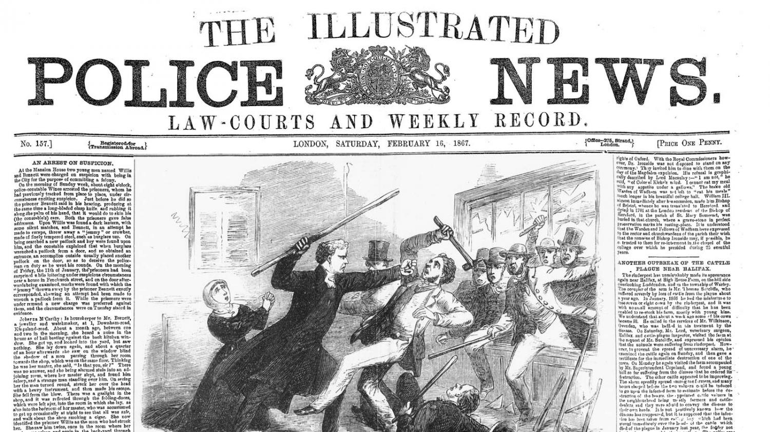
In this section it is possible to see some British newspapers of the time. We also included the American newspapers The Sun: firstly, because it is believed that the Victorian style was influenced by New York and secondly, to give an idea of what was going on across the Atlantic.
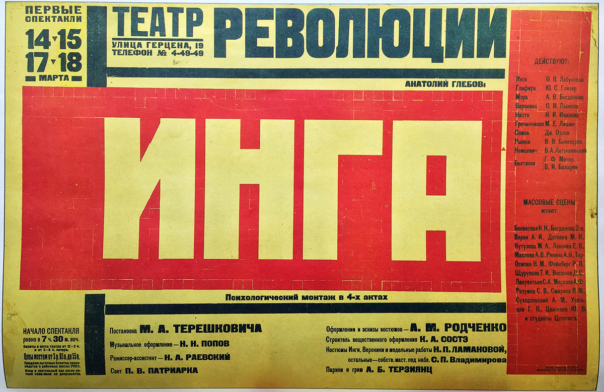
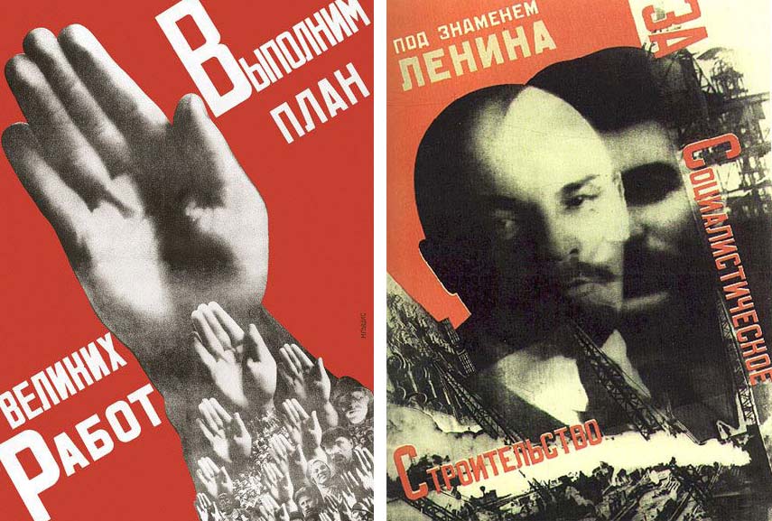
1920s - The industrial revolution is here!
Background
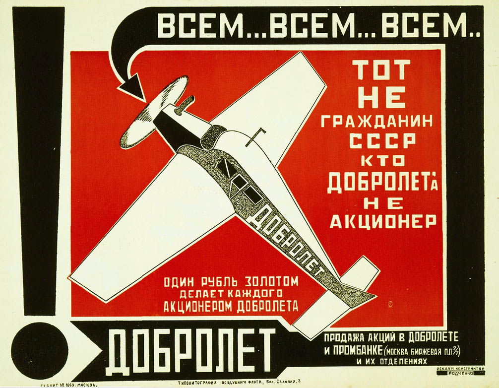
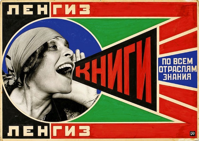
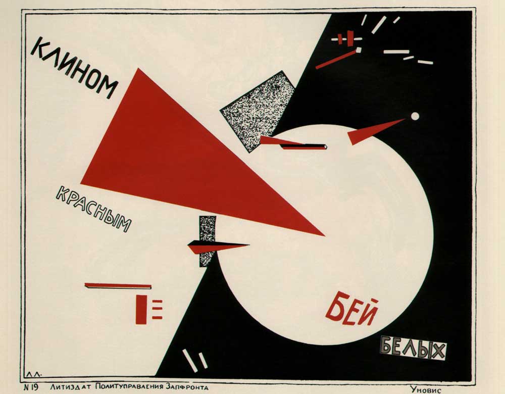
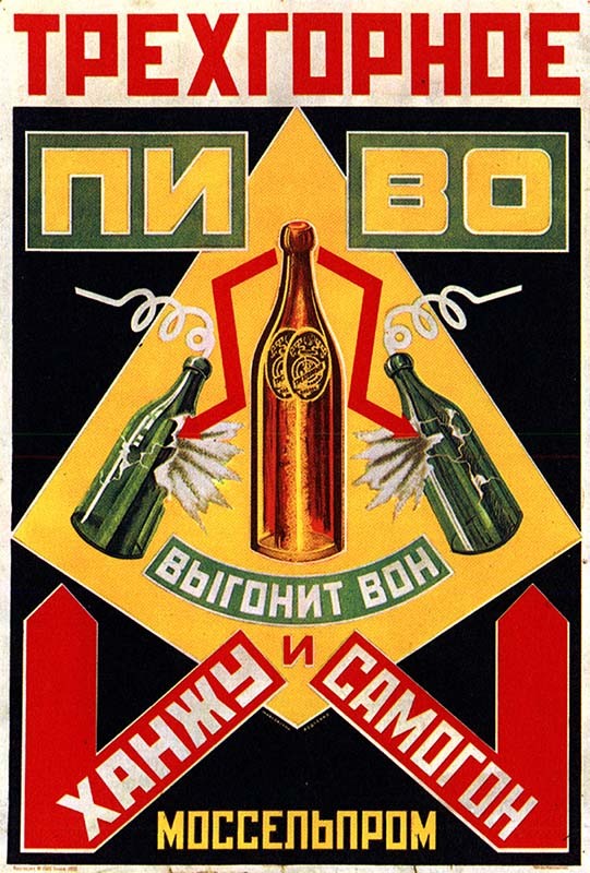
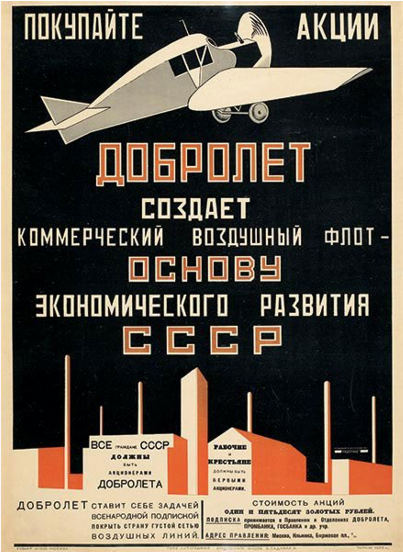
Costructivsm was an artistic and architectural movement that started in Russia at the beginning of the XX century. The term "Construction Art" was first used as a derisive term by Kazimir Malevich to describe the work of Alexander Rodchenko in 1917, but Constructivism as theory and practice was derived later at the Institute of Artistic Culture (INKhUK) in Moscow around 1920s. Constructivist architecture and art had a great effect on modern art movements of the 20th century, influencing major trends such as the Bauhaus and De Stijl movements. Its influence was widespread, with major effects upon architecture, sculpture, graphic design, industrial design, theatre, film, dance, fashion and, to some extent, music.
With its abstract and austere philosophy, constructivist art aimed to reflect modern industrial society and urban space. The movement rejected decorative stylization in favour of the industrial assemblage of materials, trying to recreate what the industrial field could be translated in art. It goes without any saying that Costructvism is deeply interrelated with the societal and political context of the soviet regime of that time. Constructivists were in favour of art for propaganda and social purposes, and were associated with Soviet socialism, the Bolsheviks and the Russian avant-garde.
The layout
Constructivism was mainly devoted at creating artworks that could spread the ideas of the soviet ideology. For what it concerns typography, posters were the best way to popolarise communism. For this reason, some abstracting and reworking were required in order to adapt this style in the context of a a magazine which includes up to three articles in the same page. The general idea was to maintain the rigid structure typical of this typographical style while preserving readability. Thus the whole layout has to be stricly rectangular with very significan black borders delimiting each element; no rounded borders were allowed and no thin lines.
The first thing that should capture the reader attention is the main title: printed with an bold and large font, taking most of the main cover page should really give the feeling of a shout-out statement. For this reason, we have large font size for the title (rigorously in uppercase letters), while the ratio between the font size of the title and the font size of the main text is not less than an half (i.e. 0,5em). In order to reproduce the feeling of a poster, the whole text of the main body has been rendered in small caps. For what it concerns the font family, I used two complementary fonts that were developed by the same person (Neogrey Creative). Both Konstruktor and Red October aim at recreating the spirit of the soviet Russia, somehow mimicking the Cyrillic alphabet but still maintaining readability for western languages.
Secondary, no fancy images are allowed in the cover page! This is the soviet revolution after all. The fancy and capitalistic images that usually cover the non-socialistic magazines have been replaced with a stylised artwork that represents the industrial work. This is not only an aesthetical element, but it is also a very symbolic element: art is not more than something that can be industrially created. Regarding symbolism, authors have been displaying along hammers that represent the hard work that each comrade puts in their writing, highlighting the factory-feeling of every form of art.
In order to recreate the feeling of a soviet poster, sharp and bold black lines have been drawn to “frame” the whole content and to divide the main sections of the article i.e. to separate the cover and the article body and to subdivide the hierarchy of the text (h3, h4, h5 and h6). The main title is cantered with a significant padding both to the right and to the left, while the text has almost zero padding in order to exploit all the surface available for the text. Additional focus was put for blockquotes boxes, which are again slightly rotated to the left and for lists, which uses a small triangle to indicate an unordered list (no numerical order is allowed!). An eventually ordered list would be automatically rendered as an unordered one because it would not fit the rationale of the time. Links have been displayed in slighly heavier font with a contrasting colour (i.e. cream). Finally, tables have a similar layout to the titles frame, with large black borders and a black/white constrast for text.
The colours
Three main colours were used for the articles: red (#ce2909), black (#212528) and white/cream (#f1f5dc). Red is probably the most important one, both for its huge impact on the screen and for its obvious political meaning. I have decided to play with the double contrast of white on red and black on red. This should recreate the feeling of the posters of that time (cf. sources). Moreover, the rest of the page has been painted with a opacque green that is perfect to render all the differnt parts of the layout.
Dark Red
#ce2909
Black
#212528
Ivory
#f1f5dc
Dark Green
#344c47
Sources
- http://guity-novin.blogspot.com/2012/04/modern-newspaper-magazine-layouts.html
- https://en.wikipedia.org/wiki/Constructivism_(art)
- https://www.theartstory.org/movement/constructivism/
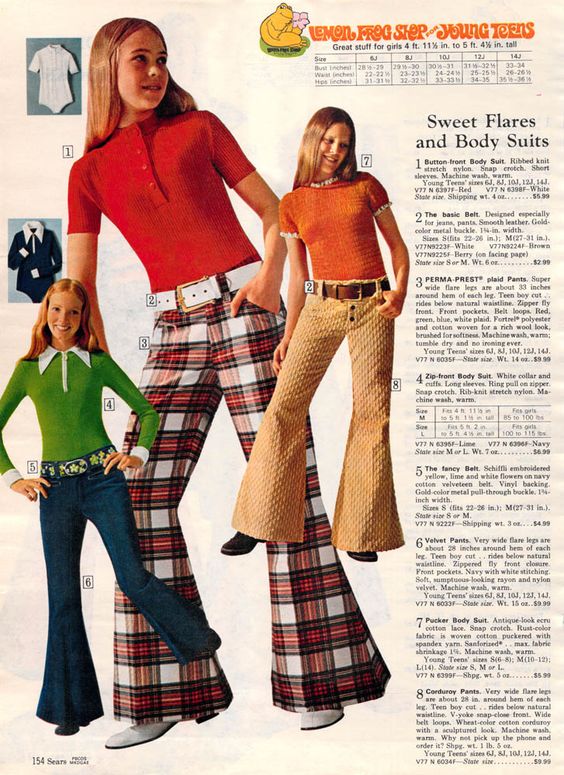
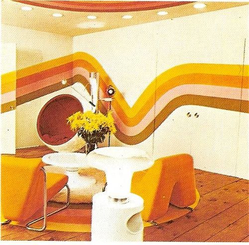
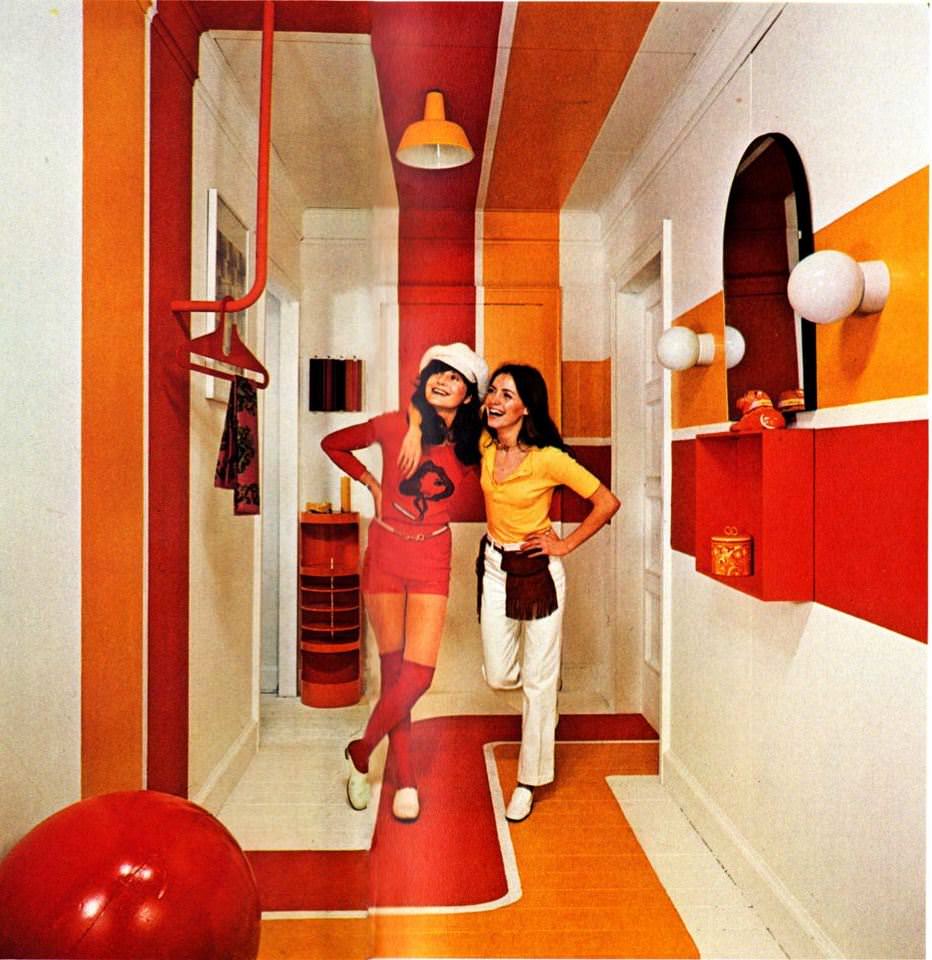
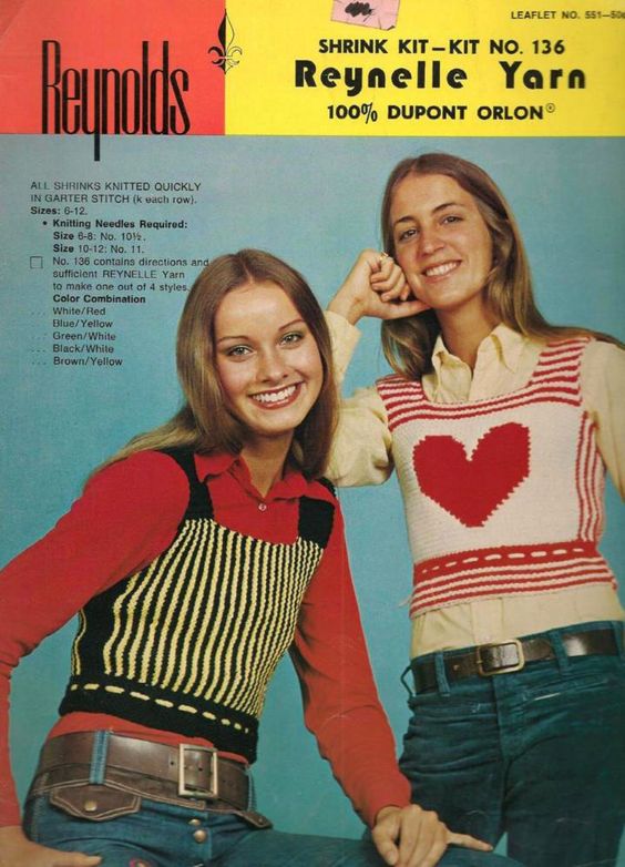
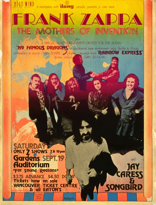
1970s - GrOoOovy times
Background
1970s society, which went trhough a decade of renewed political awareness and social progressivism, continued on the path of progressive values. Hippie culture, the counterculture of the sixties, began to be more and more widepread, and was transformed in this period into a solid social and political view, which involved opposition to the Vietnam War, nuclear weapons, big capitalists corporates and advocated for word peace and social equality. Movements for racial justice and gender equality also gained popularity during this period. It would not be an hyperbole to say that a cultural revolution really occurred in the 1970s.
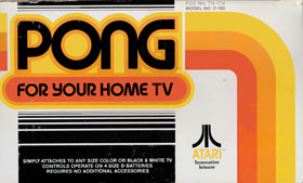
The anti-establishment trend was expressed in the use of innovative designs. This big cultural revolution, in fact, involved a shift in the common aesthetic taste, a phenomenon which also begun in the previous decade. Bright colours were everywhere, the general look was bright, sunshiny, modern, eye catchy and extravagant. The use of wide, ondulated and vertical lines and abstract weaves are common in many designs. This aesthetic pervaded almost every aspect of cultural and commercial artifacts: from shop signs to commercial banner, from albums, books and magazines covers to social and political flyers, end even entered the fashoin industry and home décor. Wall décor, in particular, made use of abstract paintings and sculptures to give a flowy and modern looking dimension to rooms. Some companies even adopted this style in their logos, expecially those who cared about young people’s attention, such as Atari, which was born during this period.
Because colours are so important to this aesthetic, some popular colour combinations van be defined, remembering that, in general, bright and vibrant tones are preferred, even if some pastels tonalities can also be observed. The following is a list of the most common combinations, but many more exist.
- Yellow and orange
- Green and blue or purple
- Rainbow
- Pink and green
- Red blue and yellow
The layout
For this part of the framework, we decided to draw our inspiration from a variety of artistic fields. Since no distinctive feature emerged in the field of magazine typography during this period, we instead decided to recreate a design that could render the aesthetic previously defined. Among the artistic fields we considered during the design process, some were especially meaningful:
- Music and fashion magazines (Music and fashion are almost indistinguishable at this point. Musicians are fashion icons, and fashion is deeply influenced by the musical sphere)
- Logos and commercial items
- Home décor
- Abstract art
For what concerns the main page of the websites, we tried to render this 70s vibe by inserting a background image recalling many of the abstract themes popular at the time. The colours chosen for the page are mostly warm and deep, but there is nonetheless place for cooler colours or pastel tones.
The font family of the titles and subtitles closely recalls those big flamboyant fonts used during that time, and it is called “NewSense”. Both this font and the one used in other sections of the text are sans serif fonts, according to the predominant taste of the time as we were able to understand it. All the fonts used during the design process have been drawn from tools such as google fonts to be directly used as web fonts, or other free fonts providers, in which case the fonts have been transformed into web fonts with an online tool called “Font Squirrel”.
As for the organization of the pages, for both the front page and the articles, the text is not divided in columns, as we did not find much evidence of that being a particular preference at the time. Some magazines did show text divided into columns, but we did not believe this element to be particularly significant. At the end, we decided to leave the text in one column, as if it were almost some kind of flyer, or the back cover of a record.
Another important visual element we give particular importance are borders: borders recall the lines patterns we used in the background, an element that provides plasticity and a further immersion in the Seventies spirit. We used wide, double borders to frame the images and various boxes. Also, some borders are irregular and rounded, to, once again, evoke the abstract art often depicting long flows of rounded and colourful lines.
The colours
These are the main colors used throughout the Seventies inspired layout.
Mellow yellow
#e4b241
India Green
#008000
Vivid Vermillion
#d04f2c
Maroon
#7c2f1a
Sources
1990s & early 2000s - the new millennium
Background
Even though the beginning of the new millennium was considered as a pivotal moment, we can clearly see the extension of the 90s into the early 2000s. These two decades are deeply interconnected and are one the continuation of the other.
The society is influenced, especially in America, by a successful economy that has a really low unemployment and by a consumerism society running rampant. Due to the economic boom and the consequent rise in job opportunities mass immigration grew rapidly creating the ground for a multicultural society. We can also see an improvement in the worldwide connectedness of economies and cultures after the demise of the Soviet Union in 1989. The globalization, previously struggling because of the filibuster of the URRS is now in full blossom also influenced by the World Wide Web, a 90s invention, that grew in the early 2000s and birthed the social networking era: MySPace, Friendster, Facebook and Twitter are all products of the first years of the XX century. These were also the years in which we became increasingly aware of climate change and global warming and when we finally started to accept homosexuality.
From the point of view of popular culture, we remember these years for the sitcoms Seinfeld and Friends, the flip-phones and keyboards phones (e.g., blackberries), hip-hop music and the rise and fall of questionable yet iconic fashion trends. Fashion and consequently fashion magazines were a big part of this period, and we can consider them as the relief valve in which popular culture converged and through which it was possible to draw some conclusions.
The layout
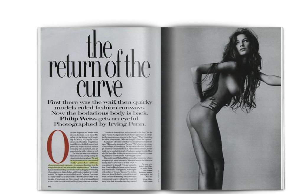
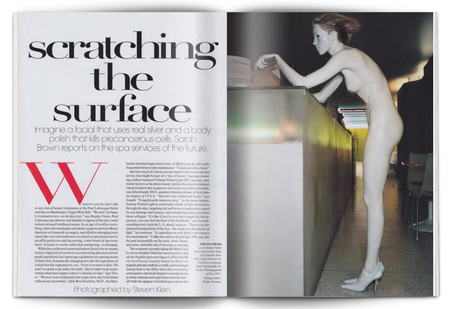
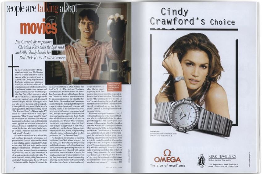
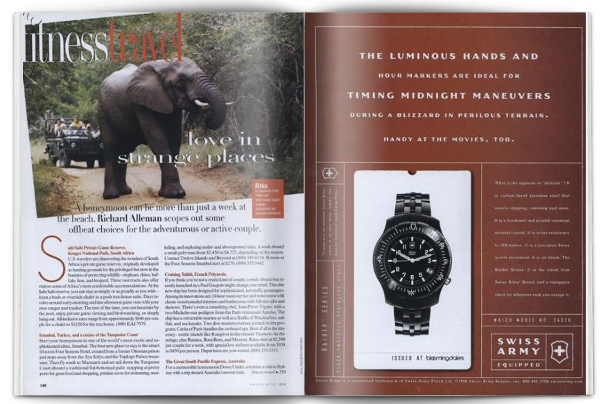
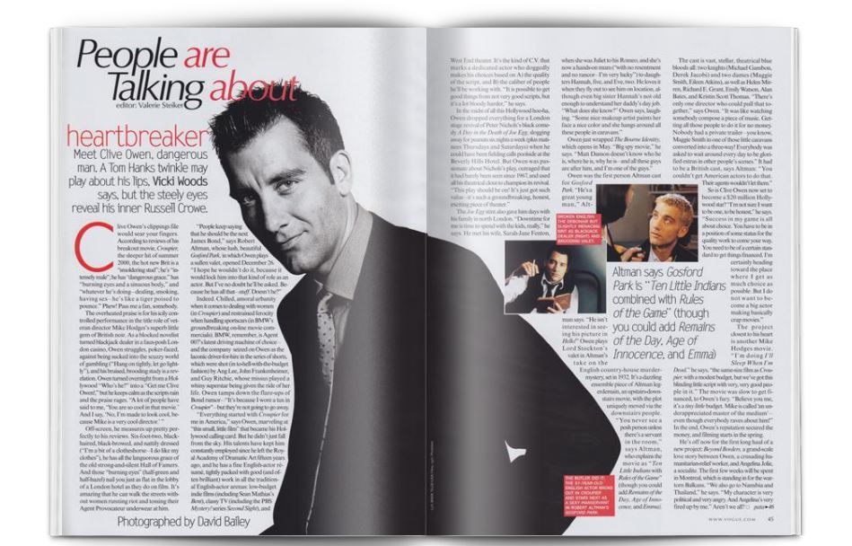
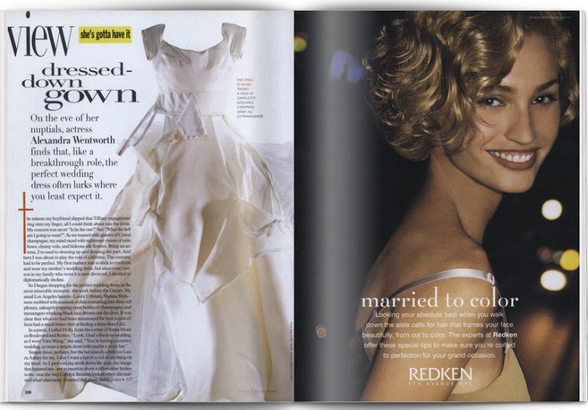
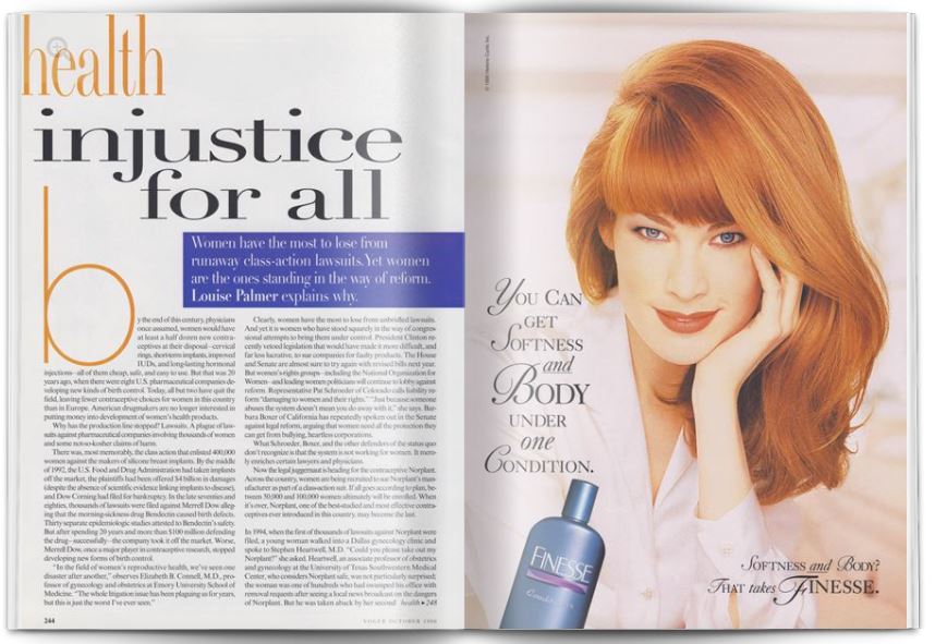
For the 90s and early 2000s we took inspiration from Vogue Magazine, especially the issues of 1996, 1998 and 2002. Typography in the 90s was expressive, bold, and since the first website was created exactly in 1990, it had a tendency towards a digital style.
Even though we tried to express the mood of the 90s and early 2000s into the design, we decided to make it lowkey and minimalistic in order to create a dashing yet elegant composition.
For the background we chose a graceful cream white colour (#F9F6F0) that looks like the paper of a fashion magazine.
The main titles are in lower case to showcase the rebellious side of the 1990s that were fresh from the previous decades where the trend of defying the norm was quite common. The font used is called sardonyxregular. For the subtitles we used Raleway, an elegant sans-serif typeface and a purplish colour. Every other secondary title is also in the purplish colour (# 81223F) and the font is Playfair display that take inspiration from the late XVIII century and it is great to accompany body text.
The paragraphs used Minion Pro (released in the 2000), a font belonging to Minion: a serif typeface released in the 90s by Adobe. It is a type intended for body text and long readings
The body of the articles is divided into 3 columns, and it starts with a font variation: a drop cap in fire opal (#DE6449), a reddish but warm colour that attracts the reader’s eye. The font used is Josefine Sans: a geometric, vintage, 1920s-inspired typeface.
For the main page we decided again to use just 1 column, once again for legibility and clarity purposes. The side columns showcase a 90s-early 2000s perfume ad.
The colours
Four colours were used for creating a simple yet elegant rendering: floral white (#F9F6F0) is the background-colour of the articles, fire opal (#DE6449) is used for the drop-cap, claret (#F1F5DC) is the colours of the subtitles and the secondary titles, finally cadet (#5F696D) is used for harmonization purposes. The choices for the colour palette were personal though everything has been thought to look like a fashion magazine of the late 90s-early 2000s.
Cadet
#5F696D
Fire Opal
#DE6449
Claret
#81223F
Floral White
#F9F6F0
Sources
For the 90s-early 2000s style our main inspiration was the american monthly magazine Vogue from which we took some representatives articles from the issues of October 1996, June 1998 and January 2002.
2030 – The future now
Background
The current year is 2030. The COVID-19 pandemics is just a bad memory in everybody's mind. Despite many political and societal changes during the last decade, humans are still heavily affecting ecologicy of planet Earth by continuosly relying on carbon fossil; an effective green revolution has not yet happened despite many technological breakthorughts. Statal entities like national governments are slowly but certainly declining due to the impact of disrputive advances in the blockchain technologies that allow citizen to exchange money and stipulating contracts without third parties’ approval. Asian countries are now leaders in most of the pivotal fields of currently economy and Chinese is becoming the first spoken language for business and scientific research. Aside for that, the everyday life of a 2030 citizen is pretty similar to the one of a 2021’s one. So how web technology evolved in the meantime?
The 2010s where undoubtedly the era of the smartphone as a every-day device for almost all the possible tasks. Despite being basically subclassed on the daily usage, desktop computers and notebook were still fundamental for many tasks, primarily due the screen size and the presence of mouse/keyboard for input. At the beginning of the 2020s, the development of foldable devices started to take place and brought some important new features for their users. First of all, it allowed to create hybrid devices that could be used as normal smartphones in their folded mode and as proper notebook in their un-folded mode. The advantages of such interoperability basically declared the death of computers as we have known them. Thus every computer is now considered as an obsolte and unsupported device.
Secondary, the traditional economy as we know it has been drastically changed by the advent of the blockchain technology and the rise of the cryptocurrency. People are now able to buy most of their goods, both outside and inside the internet, using a wide range of different crypto currencies such as Bitcoin, Ethereum and so on. They have their own crypto-wallet which can be used to rapidly exchange traditional currency (e.g. euros, dollars, etc.) with any kind of cryptocurrency and also to perform exchange between the latter. When browsing a particular item on the internet, they can decide to by the relative Non-Fungible Token (NFT) i.e. a sort of virtual copy of that resource that has a unique identifier. This has been an incredibly useful resource for online magazines that were struggling for funds.
The layout
In the context that was briefly laid out above, the layout of a web page should follow some minimalistic but fundamental rules. First of all, the text should be put at the very centre of the page in order to allow total readability of a user that is browsing thought a device in what is now refer to as “portrait mode”. This means focusing on the vertical dimension in order to scroll the text. For this reason the text is put with a padding of 5px on the top, 25px on the left, 5px on the bottom and 25px on the right. Secondary, each line is separated by a wide blank space i.e. a line height of 2. This creates a very minimalist and clear visual that enhances readability. All the columns occupy only the 80% of the whole space; this has been achieved by setting both a right and left margin of 10%. To achieve a modern visual almost all the elements have rounded borders, similarly to the currents trends in Android layout (cf. sources) and slight shadows that make them more credible. This effect has been called Neumorphism and it aims at recreating a feeling of tacticle expercience for the user.
There is also a sharp distinction between the cover page, which includes title, subtitle, description and a cover image, and the actual body of the text. The first letter of the article is showcased by increase its size, a trick that is commonly used in most of current journals and which I believe will stick around for a while in the future. Except for that, there is no need for further decorations: the cover page has a minimalistic gradient background that gives a fresh-looking style to the page, but all the focus in on the text. For this reason, the choice of a good font that is clear, elegant and at the same time easy to ready, is crucial. My choice was on Raleway, for its being already used in many important magazines and for its minimalistic aspect and Roboto, for similar reasons.
There are also some important features that are not stricly related to the visual aspect but to the web technologies of the future. First of all, a banner informs the user that he/she is using an old device to browse the content, which precludes some important feature as animated advertising (implying this is a bad thing, N.d.A.) and the possibility of listening automatically to the whole text bly clicking on the icon positioned in the cover. This feature is not actually implemented, but in the css file you can find some very basic aural features for exploiting speech properties. Altought aural features are currently deprecated, I believe that the arising of AI assistants will include a return of such features, leading to a more incluse web browsing.
The user is also allowed to buy the NFT version of the issue simply by inserting their univocal Wallet ID; but I suspect that none of us currently have one. Finally, the most important feature is the night/mode switch. By clicking on the moon icon the user can switch between two different version of the typographical style: one for the daylight and one for the nighttime. They are identical for what it concerns layout displaying, but they drastically change regarding colours. the nighttime view has a dark background and a white colour for the text, which drastically improve readability and helps user's eyes to rest. The nighttime view is starting to spread in many devices, but it is still uncommon to see that functionality on an actual web page (usually it is set as a device setting). I believe that being able to rapidaly switch between the two modes will be a popular trend in the near future.
The colours
For what it concerns the colour choice, I followed the line of simplicity: the text is plain black while the background is plain white. For the cover page a gradient looked like the best choice in order to preseverve a minimalistic aspect but also to give an aesthetically pleasant look. As it was mentioned above, the idea is to enhance as much as possible readability without distracting the reader. The only proper decoration that was developed it is related to anchors. They are displayed without underling or any other decorations, but when hoovered the anchors display a linear gradient change on the horizontal axes, giving the feeling of something “getting started”.
Slate Blue
#3B244E
Steel Blue
#357EA2
Ice
#D5E5F0
Plum
#ceb0e4
First gradient
Second gradient
Night gradient
Sources (of inspiration)
- Android 12 preview https://android-developers.googleblog.com/2021/05/whats-new-in-android-12-beta.html
- Adam Greenfield, Radical Technologies: The Design of Everyday Life, 2017
- https://99designs.it/blog/trends/web-design-trends/
- My own hopes and dreams